
Chart types include [Table], [Cross Table], [Vertical Bar Chart], [Stacked Vertical Bar Chart], [Percentage Stacked Vertical Bar Chart], [Horizontal Bar Chart], [Stacked Horizontal Bar Chart], [Percentage Stacked Horizontal Bar Chart], [Line Graph], [Area Graph], [Stacked Area Graph], [Percentage Stacked Area Graph], [Pie Chart], [Word Cloud], [Radar Chart], [Scatter Graph], [Heat Map] and [Sankey Diagram]. Users can choose the corresponding chart type according to their needs. After placing the variables in the “Dimension” and “Value” fields, the data analysis results are presented in a table form by default. Select the desired chart style in the “Chart Type” on the right. Hover the mouse over a chart icon, and the chart type description will be shown.
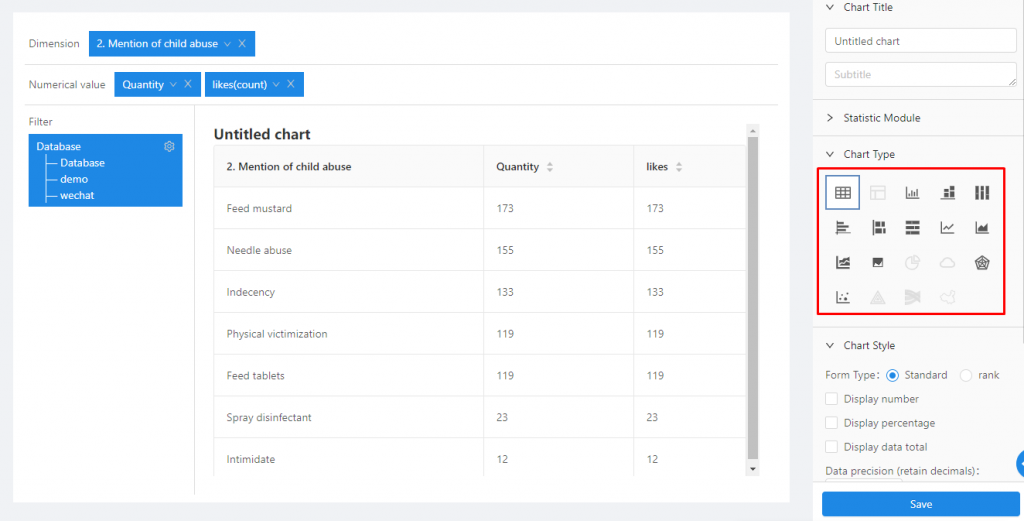
- Table: A statistical chart composed of one or more rows to display numbers and other parameters for quick reference and analysis.
- Cross Table: a cross-table arranges two variables in the row and column dimension respectively. The intersection of the rows and columns is the data in different categories belonging to both variables.
- Vertical Bar Chart: A statistical chart that uses the height of a rectangle as a variable to describe the graph. A series of vertical stripes with different heights represent the data distribution.
- Stacked Vertical Bar Chart: The stacked vertical bar chart is an extension of the vertical bar chart. The difference is that the data values of the vertical bar chart are arranged in parallel, while the stacked vertical bar chart is stacked one by one. It can display the total amount of each variable, as well as the size and proportion of each sub-category included in the variable, so it is very suitable for dealing with the part-whole relationships.
- Percentage Stacked Vertical Bar Chart: Another form of the stacked vertical bar chart. Normally the stacking is based on the numerical value, and percentage stacking is based on the percentage of the numerical value.
- Horizontal Bar Chart: A statistical chart that uses the width of a rectangle as a variable to describe the graph. A series of horizontal stripes with different widths represent the data distribution.
- Stacked Horizontal Bar Chart: The stacked horizontal bar chart is an extension of the horizontal bar chart. The difference is that the data values of the horizontal bar chart are arranged in parallel, while the stacked horizontal bar chart is stacked one by one. It can display the total amount of each variable, as well as the size and proportion of each sub-category included in the variable, so it is very suitable for dealing with the part-whole relationships.
- Percentage Stacked Horizontal Bar Chart: Another form of the stacked horizontal bar chart. Normally the stacking is based on the numerical value, and percentage stacking is based on the percentage of the numerical value.
- Line Graph: A line graph is a graphic formed by connecting various data points with straight-line segments, which displays the trend of data changes in a connected line. The line graph can display continuous data that changes over time (in a common scale setting).
- Area Graph: An area graph is a type of line graph, but the area under the line will be filled with color or texture. To draw an area graph, first mark each data point on the Cartesian two-axis coordinates, then connect them with a line, and finally fill the space below the line. Like a line graph, an area graph can show the change and development of quantitative values in a certain period of time. It is often used to show trends rather than specific values.
- Stacked Area Graph: Stacked area graph is a special area graph that can be used to compare multiple variables in an interval. The difference between a stacked area graph and an area graph is that the starting point of each data series of the stacked area graph is drawn based on the previous data series. As such, the fully-stacked height of the topmost line will correspond to the total when summing across all groups.
- Percentage Stacked Area Graph: On the basis of the stacked area graph, the total amount of the dependent variable of each area is added to form the percentage stacked area graph. The graph does not reflect the total change, but it can clearly reflect the variation of each of several variables simultaneously as well as their percentage ratio over time.
- Pie Chart: A circular statistical chart divided into several sectors, used to describe the relative relationship between volume, frequency, or percentage. In a pie chart, the arc length of each sector is a ratio of the number it represents. Together, these sectors form a complete circle.
- Word Cloud: A type of visualization highlighting the keywords that appear frequently in the text. It displays words and phrases from small to large size to demonstrate how frequently they appear, forming a cloud-like color graphic with “keyword cloud layer” or “keyword rendering”.
- Radar Chart: A radar chart is a graphical method of displaying multivariate data in the form of a two-dimensional chart of three or more quantitative variables on an axis starting from the same point. It is also called spider or web chart.
- Scatter Graph: The scatter graph is a type of plot or mathematical diagram using Cartesian coordinates to display values for typically two variables for a set of data. The scatter graph shows the general trend of the dependent variable changing with the independent variable. Based on this, you can select a suitable equation for the data point to fit. Use two sets of data to form multiple coordinate points; examine the distribution of coordinate points; observe whether there is a certain correlation between the two variables, or summarize the distribution pattern of coordinate points. A scatter graph displays the series as a set of points. The value is represented by the position of the point in the graph.
- Heat Map: A statistical graph that displays the relative magnitude of the dimensional data in the form of special color highlighting.
- Sankey Diagram: A specific type of data flowchart. The width of the branch in the figure corresponds to the size of the dataflow.