
Univariate statistical analysis is the description and inference of a variable’s quantitative characters. It is the simplest and most basic form of statistical analysis. The procedure of univariate analysis on the DiVoMiner ® platform is as follow:
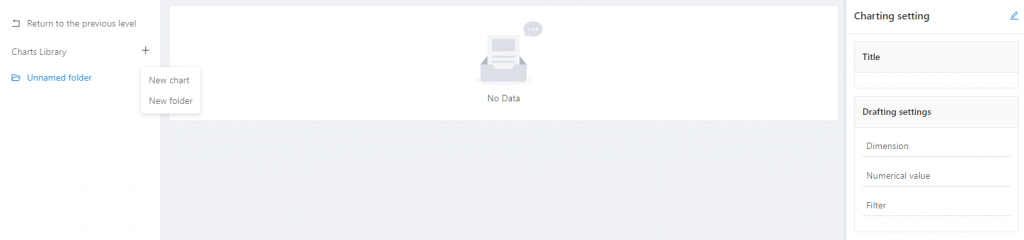
After coding, go to [Statistical Analysis]-[Chart Profiles]; click the “+” sign, and then click [Create a Chart].
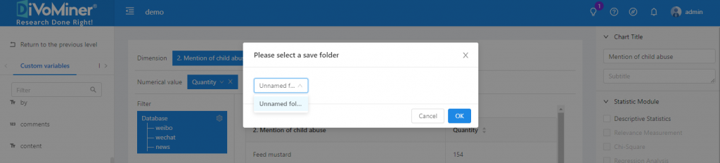
Alternatively, you can also choose [Create a Folder] after clicking the “+” sign to create a folder to store the analysis chart for file management.
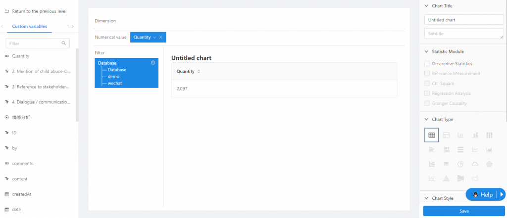
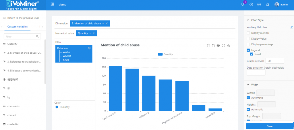
Drag and drop the variable for analysis to [Dimension] and check the results of univariate analysis.
On the right, you can customize the chart by editing the chart type and chart style.
Conduct descriptive statistical analysis through [Statistics Module].
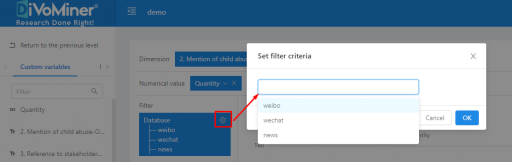
Note: The data in the sampling pool is mixed in the overall database, so if the statistical analysis chart is only for sample data, you need to specify the data with [Filter] function, to set the data scope for statistical analysis.
Click [Save] to save the chart to a specific folder.
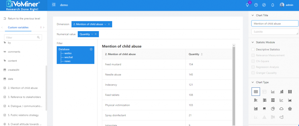
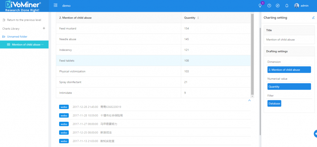
Go back to the previous page (click [Back]), and you can see the statistical analysis charts created in the folder.
Note: When viewing the chart, click on the data in the chart to display the original text (e.g. news articles, social network posts, etc.) of the data, which is convenient for the results description and in-depth analysis.
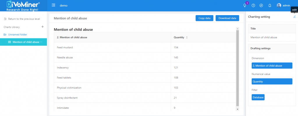
Click [Edit] in the upper right corner of [Chart Settings] to modify and edit the chart again.
TIPS: When creating vertical bar charts, horizontal bar charts, stacked bar charts, area graphs, and line graphs, you can set the “text direction” and “coordinate interval” in [coordinate X axis], as well as the “maximum value” and “Minimum value” in [coordinate Y axis], to adjust the display of the chart labels.
Leave A Comment?